Data Visualization#
Visualizing data can be helpful on many occasions, such as investigating the data and its distribution, checking for outliers, evaluating results and more.
Here we visualize some experimental data in different plots and provide some code for the most common plot types used.
The matplotlib library provides a great starting point for learning how to visualize data in Python, you can find many more plot types here.
%matplotlib inline
import matplotlib.pyplot as plt
import pandas as pd

packed_column = pd.read_csv('packed_column.csv', encoding='utf-8', sep=';')
packed_column.head()
| flow type | water flow / air flow | 0 kg/h | 100 kg/h | 200 kg/h | 300 kg/h | |
|---|---|---|---|---|---|---|
| 0 | small | 15 | 1 | 2 | 3 | 3 |
| 1 | small | 30 | 2 | 2 | 5 | 3 |
| 2 | small | 50 | 2 | 3 | 6 | 5 |
| 3 | small | 80 | 3 | 4 | 9 | 9 |
| 4 | small | 100 | 3 | 5 | 13 | 13 |
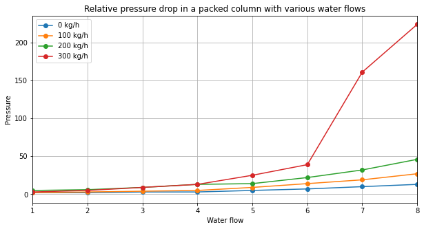
Let’s start with a standard line plot.
# create a figure and set the figsize - you can play with the size until you are happy with the proportions
plt.figure(figsize=([10,5]))

# add four line plots, one for each water flow
plt.plot(packed_column['0 kg/h'], label='0 kg/h', marker='o')
plt.plot(packed_column['100 kg/h'], label='100 kg/h', marker='o')
plt.plot(packed_column['200 kg/h'], label='200 kg/h', marker='o')
plt.plot(packed_column['300 kg/h'], label='300 kg/h', marker='o')

# Add title, labels, legend and a grid
plt.title('Relative pressure drop in a packed column with various water flows')
plt.xlabel('Water flow')
plt.ylabel('Pressure')
plt.legend()
plt.grid()

# specify x axis range
plt.xlim([1, 8])

# show figure
plt.show()
Now let’s make a scatter plot.
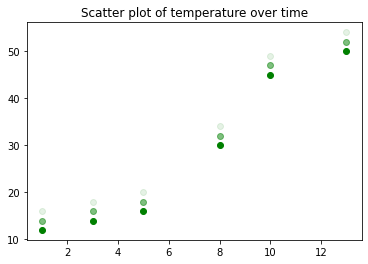
We can specify many parameters, such as the color and the alpha (transparency).
time = [1, 3, 5, 8, 10, 13]
temperature = [12, 14, 16, 30, 45, 50]

# define type of plot - here we'll make a scatterplot
plt.scatter(time, temperature, alpha=1, color='green')
plt.scatter(time, [i+2 for i in temperature], alpha=0.5, color='green')
plt.scatter(time, [i+4 for i in temperature], alpha=0.1, color='green')
plt.title('Scatter plot of temperature over time')
plt.show()
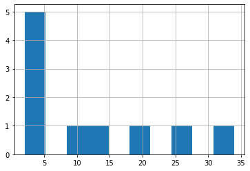
Note, you can also use pandas functions for a quick plot, but for more elaborate and nice plots, matplotlib or similar libraries are recommended.
packed_column['100 kg/h'].hist()
<AxesSubplot:>
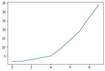
packed_column['100 kg/h'].plot()
<AxesSubplot:>
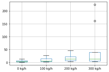
packed_column[['0 kg/h', '100 kg/h', '200 kg/h', '300 kg/h']].iloc[:-1, :].boxplot()
<AxesSubplot:>
